


Typography 31 - Type Directors Club
Title
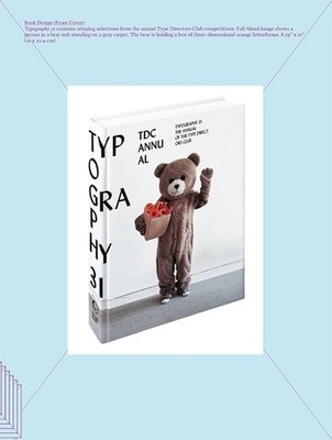
Typography 31 - the annual of the Type Director's Club
Typography 31 - the annual of the Type Director's Club
Author
Type Directors Club
Type Directors Club
format
Hardback
Hardback
Publisher
Harper Design
Harper Design
Language
English
English
UK Publication Date
20110303
20110303
The Type Directors Club presents its annual showcase of the year's best typographic work in this visually provocative, far-reaching compendium of innovative, successful design strategies. Following in the footsteps of previous Typography editors such as Shanon Werner and Emily Oberman, design guru Paul Sahre uses his background in off-Broadway poster art and book jacket design (for authors such as Rick Moody, Chuck Klosterman, Ben Marcus, and Victor Pelevin) to uncover, collate, and illuminate the year's most unique and effective uses of typography in books, magazines, stationery, web graphics, and more. Typography 31 is a must-have for every professional graphic designer, and a peerless asset to anyone looking for insight into what makes design work.
We are Rated Excellent on Trustpilot
Here's what you say about us...
We are Rated Excellent on Trustpilot
Here's what you say about us...
Each year, the Type Directors Club selects a prominent design studio or designer for the latest Typography book, which showcases the winners of their annual typography competition. Tremendous creative freedom is given to each studio, which is why this annual book evolves and varies from year to year.
The designer of Typography 31 is Paul Sahre. Paul is a well-known graphic designer, illustrator, educator, author and former World Graphic Design Foosball Champion. Paul established his New York studio in 1997. The balance he strikes between commercial and personal projects is evident in the physical layout of his workspace: part design studio, part silkscreen lab, part classroom. In one room he designs and prints posters (some now in the permanent collection at the Cooper-Hewitt National Design Museum) for various off-off Broadway theaters, while in the other room he is busy designing book covers for authors such as Rick Moody, Chuck Klosterman, Ben Marcus and Victor Pelevin.
Paul received his BFA and MFA in graphic design from Kent State and teaches graphic design at the School of Visual Arts. He is a frequent contributor to the New York Times Op-Ed page, a member of Alliance Graphic International, and the author of Leisurama Now: The Beach House for Everyone, 1964-, a loving look at a short-lived product of early '60s consumer optimism: affordable middle-class summer homes.
Type
BOOK
Keyword Index
Graphic design (Typography) - Periodicals.|Commercial art - Periodicals.|Layout (Printing) - Periodicals.
Country of Publication
New York (State)
Number of Pages
355